RESTAURANT WEB-APP
Setting the Scene:
As the concept and practice of ordering things online have gained more social acceptance, so has the demand for similar services to accommodate all other needs.
About the Project:
Given the fast-paced nature of this industry, we have to learn and relearn new technologies
and new ways of using old technologies to innovate, excite, and simplify the lives of our
users.
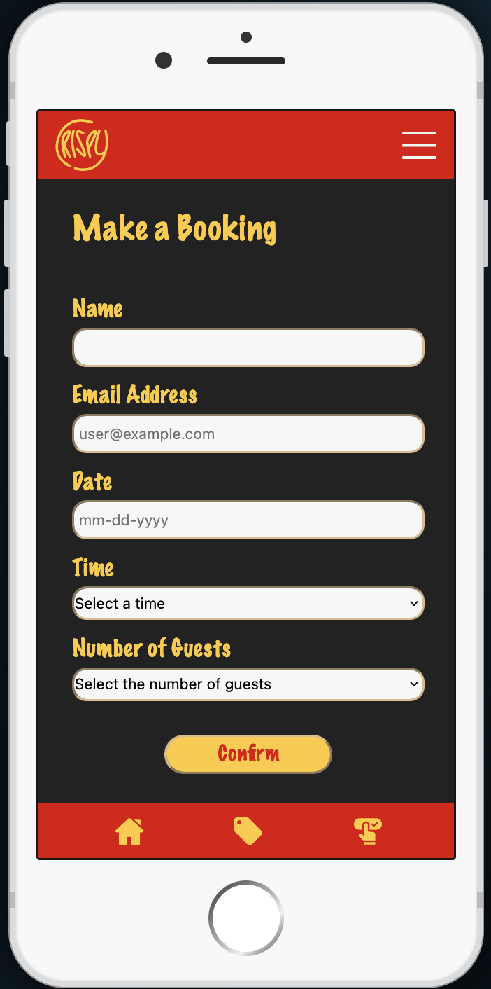
Mobile phones have been steadily rising as the de facto device used by the
world to interact with the internet, so I got tasked with creating a Restaurant Reservation
Booking Web-App as a college project to eliminate the time and energy cost of in-person
reservations and streamline the whole process.
Challenges Faced:
As this was my first foray into App Design, I had to not only think about how to arrange the
elements on the screen. I also had to keep the structure and order of the different pages or
screens themselves to provide a more fluid experience to the user.
For that, I needed
to think more about who the user is and the situations or places where they would use such a
service.
Thinking it Out:
After pondering about it for a while, I came up with a general idea of the "who" and the "where";
The target audience for this type of app is a person driven by their work or hobbies and who like
to plan their life meticulously, but unfortunately don't get the time to cook themselves.
From there, I concluded that striking yet professional visuals and intuitive design would be the
most sought-after characteristics to help make a decision more quickly. With that in mind, I started
structuring things so that most items were reachable with the least amount of interactions possible.
Even though I would've liked to have bold aesthetics throughout the app, due to concerns
about it clashing with user satisfaction, complex design and overtly fancy animations didn't seem
like the way to go.
Getting to Work:
Colours and typography played a pivotal role in figuring out how to maximise effective visual
communication.
For this reason, the colours for each restaurant are derivatives of the
ever-popular Red and Yellow combination, as according to colour psychology, these colours work
well together to invoke or increase the sense of hunger.
The typefaces also received
this attention to detail, so all body copy fonts boast a geometric design with good contrast
making it easier to read. Meanwhile, the titles and logotypes are bolder to accentuate and
bolster each brand's identity.
Lessons Learnt:
Being in charge of everything, from Branding & Asset Creation to UX/UI Design to Web Design & Development, on this project has taught me the importance of exercising simplicity and the flow of an app.
Skills Exercised:
The prototyping and brainstorming phase was done in Adobe Illustrator, and the project required HTML, CSS, GSAP, jQuery, and some Vanilla JavaScript for good measure.